 03-02-2009, 12:43 PM
|
#1093
|
|
MJMfX.com Designer
Join Date: Dec 2003
Location: back in somich
|
I figured a 'word' rating would be better than a number rating.. but 4/10
..and you didn't rate mine  |

|
|
 Sponsored Links
|
Remove Advertisement
|
|
Advertisement
|
|
|
03-02-2009, 01:18 PM
|
#1094
|
|
|
well to continue the trend of textposts, knuckhead09 that is tight as hell. The nose looks perfect, the mouth looks a lil off.
If you ever finish it, post up with the finished result.
9/10 fo sho
__________________
Insidious Designs - offering logo, jersey and webdesign. PM me for details.
|
|
|
|
|
03-02-2009, 04:25 PM
|
#1095
|
|
CodyB
Join Date: May 2006
Location: Denver
|
Quote:
Originally Posted by stonebag

Faces seem a bit choppy, but it looks like thats what the theme is. Pretty cool, how'd she like it? 8/10
Another shirt I made when I got bored in graphics class.
 |
I have those brushes too! -.-
__________________
Houston Heat
PhotoMOB
|
|
|
|
|
03-03-2009, 12:31 AM
|
#1096
|
|
VCU Rams
Join Date: Apr 2005
Location: Richmond, VA
|
Quote:
Originally Posted by knuckhead09
It's alright.. your dime a dozen paintball logo, but I'm sure they'll like it 
Just got Illustrator and a tablet, been 'painting' this:

~4 hours invested so far, but it's really teaching me how to use the tablet which is the overall goal. |
looks good so far, should look amazing when its done
8/10 since there isnt much done.
heres just something new i wanted to try in photoshop, any tips from some of the better photoshoppers in here? ...oh, and apologies for the margin rape


__________________
KPS PAINTBALL | VCU RAMS | RICHMOND RAGE
Last edited by Pakistani : 03-03-2009 at 05:00 PM.
|
|
|
|
|
03-03-2009, 06:27 PM
|
#1097
|
|
Honda S2000
|
Quote:
Originally Posted by PbLoSeR05
I have those brushes too! -.-
|
Do ya! That is awesome, because that is what brushes are for!
smart *** |
|
|
|
|
03-03-2009, 10:04 PM
|
#1098
|
|
Half man...Half amazing
Join Date: Oct 2004
Location: PA
|
Quote:
Originally Posted by Pakistani
looks good so far, should look amazing when its done
8/10 since there isnt much done.
heres just something new i wanted to try in photoshop, any tips from some of the better photoshoppers in here? ...oh, and apologies for the margin rape
|
6
Make the shadows darker. Don't show so much of the paintball pics in the shadow. So you should be able to see the bottom edge of the background
new site I'm working on. The background isn't really in this because I already started slicing it. |
|
|
|
|
03-04-2009, 01:14 PM
|
#1099
|
|
inconceivable
Join Date: Mar 2004
Location: NJ
|
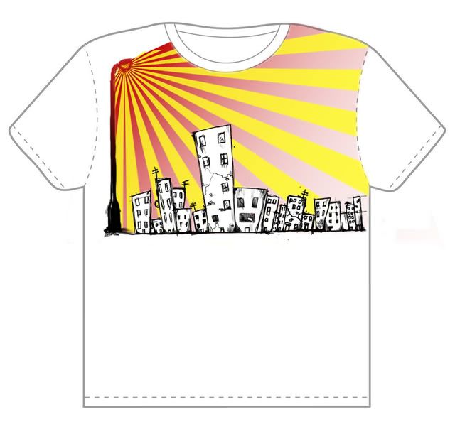
looks pretty dope 9/10
just messing around with one of my designs and thought this came out pretty cool
[IMG] 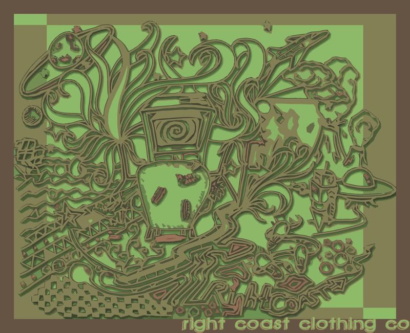 [/IMG]
__________________
Playground Royals To be a rock and not to roll
|
|
|
|
|
03-04-2009, 08:21 PM
|
#1100
|
|
Honda S2000
|
Quote:
Originally Posted by Bad Arse Pirate
6
Make the shadows darker. Don't show so much of the paintball pics in the shadow. So you should be able to see the bottom edge of the background
new site I'm working on. The background isn't really in this because I already started slicing it. |
Why is that kids hat so big? |
|
|
|
|
03-04-2009, 08:53 PM
|
#1101
|
|
The mad santa hatter
Join Date: May 2007
Location: random GDT
|
Quote:
Originally Posted by East§ide
looks pretty dope 9/10
just messing around with one of my designs and thought this came out pretty cool
[IMG][IMG]http://i2.photobucket.com/albums/y26/njhardc0re/RC%20Designs/RCCRAZYCOOLcopy.jpg[/MG][/MG]
|
Im really liking the look of that, very nice color scheme, good detail and i could tell that took alot of effort. Definentally a nice change from the usually over hyped designs we tend to see. 9.5/10
Heres some random **** ive had to do in Graphics class.
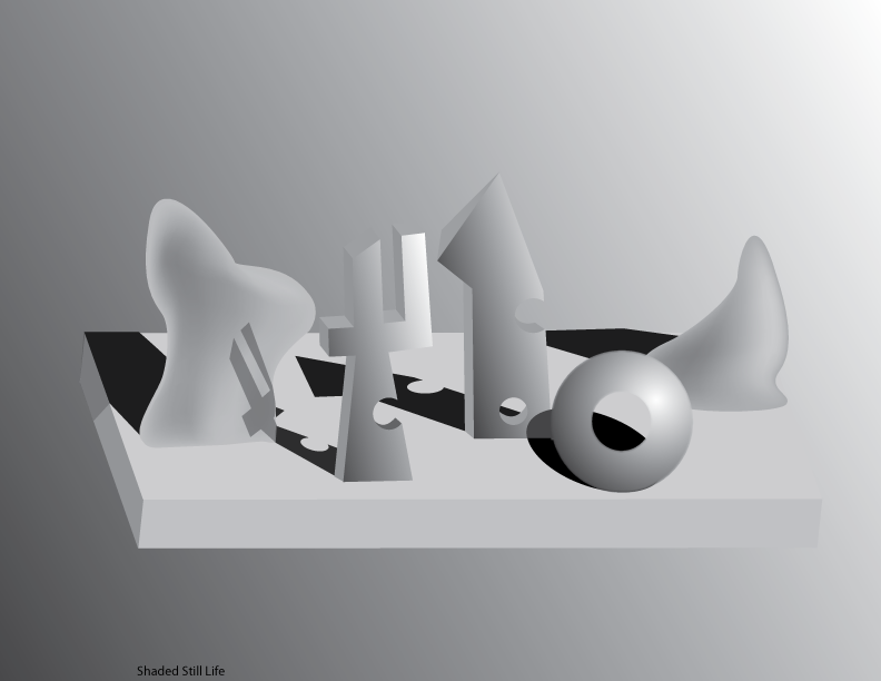
Typography:

Shading with mesh gradients
__________________
---------------------------
"Originally posted by SmArT-SpOrKs: Jesus Tapdancing christ this thread is a cluster**** on both sides. Its like the civil war, but replace muskets with pool noodles and everyone has a wicked sunburn."
ST PHOTOBUCKET_-_ ST:GDT 10,000 posts and counting
c4designs.org
|
|
|
|
|
03-04-2009, 09:18 PM
|
#1102
|
|
Legendary.
Join Date: Oct 2004
Location: Kirkland, WA
|
8 for the text, 9 for the shading.
Wallpaper
 |
|
|
|
|
03-05-2009, 08:34 AM
|
#1103
|
|
inconceivable
Join Date: Mar 2004
Location: NJ
|
8/10
i really really like the look of that, but i feel like its just missing something..
__________________
Playground Royals To be a rock and not to roll
|
|
|
|
|
03-05-2009, 03:11 PM
|
#1104
|
|
Awaiting Email Confirmation
|
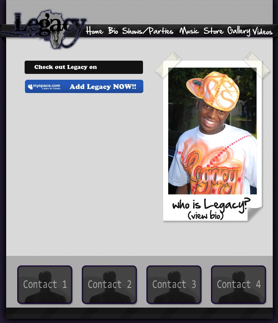
Nothing to rate lol,
Decided to make something for my myspace
__________________
HACKEDHACKEDHACKEDHACKEDHACKEDHACKEDHACKEDHACKEDHA CKEDHACKEDHACKEDHACKEDHACKEDHACKEDHACKEDHACKED
Last edited by SniperAt300FPS : 03-05-2009 at 08:38 PM.
|
|
|
|
|
03-05-2009, 03:43 PM
|
#1105
|
|
VCU Rams
Join Date: Apr 2005
Location: Richmond, VA
|
Quote:
Originally Posted by East§ide
8/10
i really really like the look of that, but i feel like its just missing something..
|
dont rate unless you have a picture.
__________________
KPS PAINTBALL | VCU RAMS | RICHMOND RAGE
|
|
|
|
|
03-05-2009, 03:44 PM
|
#1106
|
|
MJMfX.com Designer
Join Date: Dec 2003
Location: back in somich
|
...you made a text post, the only thing thats worse than rating without a picture.
Didn't get much feedback on this last time:
www.mjmfx.com/desktop |
|
|
|
|
03-05-2009, 04:09 PM
|
#1107
|
|
Half man...Half amazing
Join Date: Oct 2004
Location: PA
|
8/10
I like it--Artistically its great. But the only concern I have is the nav isn't very clear cut. What I would do is have another nav bar right underneath it all with plain links.
Something I did maddddd long ago.
I just grabbed this so I wouldn't rate without posting anything of my own. |
|
|
|
|
03-05-2009, 06:26 PM
|
#1108
|
|
inconceivable
Join Date: Mar 2004
Location: NJ
|
meh/10
idk..just dont love it.

__________________
Playground Royals To be a rock and not to roll
|
|
|
|
|
03-05-2009, 08:39 PM
|
#1109
|
|
Awaiting Email Confirmation
|
8/10 i like the background, but for some reason the URL is too bold and draws too much attention, tone it down a little to go with the rest of the picture.
EDIT: Maybe a lighter color for the URL
was never rated because some people find it necessary to spam..
__________________
HACKEDHACKEDHACKEDHACKEDHACKEDHACKEDHACKEDHACKEDHA CKEDHACKEDHACKEDHACKEDHACKEDHACKEDHACKEDHACKED
Last edited by SniperAt300FPS : 03-05-2009 at 08:43 PM.
|
|
|
|
|
03-05-2009, 09:11 PM
|
#1110
|
|
The mad santa hatter
Join Date: May 2007
Location: random GDT
|
looks pretty good especially if you vectored the man in the text, my only suggesting would be to skew the shadows to one side because a shadow would never be cast that long and straight forwards. 7/10
Post this again just to get another rating

__________________
---------------------------
"Originally posted by SmArT-SpOrKs: Jesus Tapdancing christ this thread is a cluster**** on both sides. Its like the civil war, but replace muskets with pool noodles and everyone has a wicked sunburn."
ST PHOTOBUCKET_-_ ST:GDT 10,000 posts and counting
c4designs.org
|
|
|
|
|
03-05-2009, 09:55 PM
|
#1111
|
|
Awaiting Email Confirmation
|
9/10
Only thing is the gun is a little bit towards the left, to i'd expect the bold blue lines to be on the right side, where you can see more of the gun. Other than that, its great.
EDIT:

__________________
HACKEDHACKEDHACKEDHACKEDHACKEDHACKEDHACKEDHACKEDHA CKEDHACKEDHACKEDHACKEDHACKEDHACKEDHACKEDHACKED
Last edited by SniperAt300FPS : 03-05-2009 at 10:02 PM.
|
|
|
|
|
03-08-2009, 01:30 AM
|
#1112
|
|
Greek, I am it
Join Date: May 2007
Location: Terrain eval, standby
|
8/10
The colors don't do it for me, and the truck is too faint.

__________________
ST GDT Crew: OVER 10,000
USAF
ΜΟΛΩΝ ΛΑΒΕ
We're trapped in the belly of this horrible machine.
And the machine is bleeding to death.
|
|
|
|
|
03-11-2009, 02:07 PM
|
#1113
|
|
Rolph
Join Date: Dec 2006
Location: Virginia Beach
|

first time using illustrator, made a logo for a project im doing in a marketing class |
|
|
|
 Posting Rules
|
You may not post new threads
You may not post replies
You may not post attachments
You may not edit your posts
HTML code is Off
|
|
|
|


 Your Privacy Choices