 02-19-2009, 05:39 PM
|
#1051
|
|
The mad santa hatter
Join Date: May 2007
Location: random GDT
|
Quote:
Originally Posted by zimm41

brah you realize i was showing him what a logo was? i did that in under 5 min. my friend i was sitting here with added the is a douche part. all i was saying was he made a picture not a logo. that hideous thing i posted is in no way meant to be anything legit.
|
There was nothing wrong with his, im pretty sure he knows what a logo looks like. Theres a line between constructive criticism and an insult. And honestly do you expect us to believe your friend wrote douche on the bottom.
__________________
---------------------------
"Originally posted by SmArT-SpOrKs: Jesus Tapdancing christ this thread is a cluster**** on both sides. Its like the civil war, but replace muskets with pool noodles and everyone has a wicked sunburn."
ST PHOTOBUCKET_-_ ST:GDT 10,000 posts and counting
c4designs.org
|

|
|
 Sponsored Links
|
Remove Advertisement
|
|
Advertisement
|
|
|
02-19-2009, 05:43 PM
|
#1052
|
|
inconceivable
Join Date: Mar 2004
Location: NJ
|
theres 2 parts to this:
1. there are designers..people who have an eye for design and all that it implies
2.there are computer artists..people who have the skills to make things using the different programs
sometimes people are both, but i think the most important quality if the first part. the intellectual concepts are worth far more than the finished product. alot of people on here are excellent computer artist, but ****ty designers.
im not professing to be amazing at either, but i think that's the issue with this pissing contest.
__________________
Playground Royals To be a rock and not to roll
|
|
|
|
|
02-19-2009, 06:47 PM
|
#1053
|
|
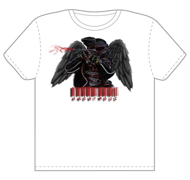
Honda S2000
|
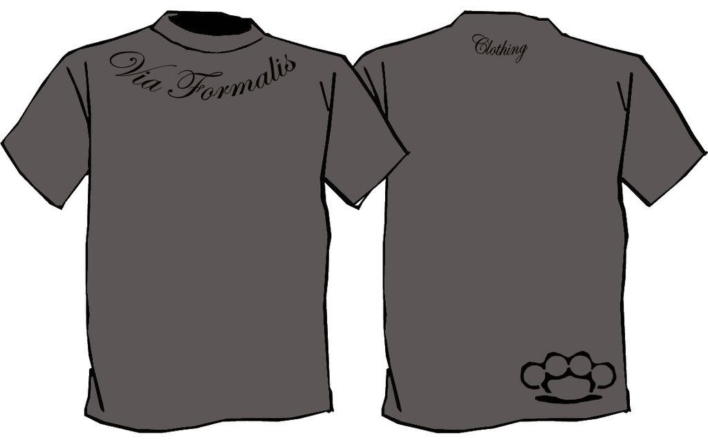
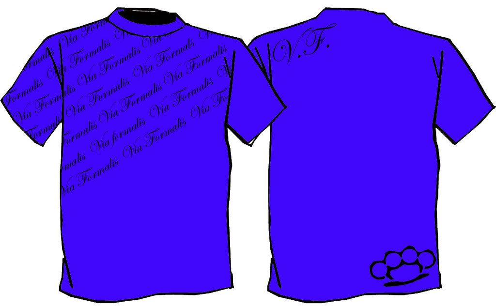
Shirt I am going to get printed in graphics class that I made:
 |
|
|
|
|
02-19-2009, 06:47 PM
|
#1054
|
Join Date: Feb 2009
Location: **** Texas
|
Another sig guys. For my friend Storm
 BTW THE CITYSCAPE IN THIS ONE IS A BRUSH. JUST TO CLARIFY FOR THE IGNORANT BASTARD WHO LIKES TO TROLL THIS THREAD
Oh and good job bro i would rock that shirt anyday. I would recommend printing it in black though because i believe it would blend the colors a bit better, but that's up to you Also idk but id like the design to be a bit bigger... 9/10
Last edited by Sully. : 02-19-2009 at 06:55 PM.
|
|
|
|
|
02-19-2009, 07:19 PM
|
#1055
|
|
|

WIP, needs more time tinkering with some of the anchors and/or anchor handles.
Sig looks aright, imho too much going on for something that small.
__________________
Insidious Designs - offering logo, jersey and webdesign. PM me for details.
|
|
|
|
|
02-20-2009, 01:52 AM
|
#1056
|
|
VCU Rams
Join Date: Apr 2005
Location: Richmond, VA
|
Quote:
Originally Posted by spangley_special
WIP, needs more time tinkering with some of the anchors and/or anchor handles.
Sig looks aright, imho too much going on for something that small.
|
im not sure what that is supposed to be for, but i really like the style.
if i could offer a suggestion, it would be to lessen the amount of empty space.
other than that, awesome, clean work 9/10.
heres something i threw together in 10 mins.
slightly messed with exposure and levels, put a blur on the lines, and some simple text.
nothing over the top, just something clean-
__________________
KPS PAINTBALL | VCU RAMS | RICHMOND RAGE
|
|
|
|
|
02-20-2009, 02:25 PM
|
#1057
|
|
Guest
|
8/10
Something I did for a guy on a different forum. He wanted the fairings to be yellow and the wheels, swing arm, and front shocks a matte black.
Before

After
 |
|
|
|
|
02-20-2009, 03:09 PM
|
#1058
|
|
Guest
|
thats not serious right.... =/
|
|
|
|
|
02-20-2009, 05:27 PM
|
#1059
|
|
A.F.F.A
Join Date: Dec 2004
Location: NY/WA
|
Quote:
Originally Posted by r_racer11
There was nothing wrong with his, im pretty sure he knows what a logo looks like. Theres a line between constructive criticism and an insult. And honestly do you expect us to believe your friend wrote douche on the bottom.
|
seeing as how he was sitting right here next to me yeah. positive of that part was he wants to learn PS now, and yeah i realize it may of been a dick move but it was my dick move of the week so im set for a few days now.
still wanna know if your gunna put flash pics in those grey boxes cause that would be pretty sick.
__________________
Im back on the saddle again
|
|
|
|
|
02-20-2009, 05:29 PM
|
#1060
|
|
A.F.F.A
Join Date: Dec 2004
Location: NY/WA
|
Quote:
Originally Posted by Sully.
Another sig guys. For my friend Storm
BTW THE CITYSCAPE IN THIS ONE IS A BRUSH. JUST TO CLARIFY FOR THE IGNORANT BASTARD WHO LIKES TO TROLL THIS THREAD
Oh and good job bro i would rock that shirt anyday. I would recommend printing it in black though because i believe it would blend the colors a bit better, but that's up to you Also idk but id like the design to be a bit bigger... 9/10 |
brah i dont troll this thread i have more posts in this forum than anywhere else on the site. and im not a bastard, my parents kept me. i am however an *******. so get it right ok?
__________________
Im back on the saddle again
|
|
|
|
|
02-20-2009, 05:31 PM
|
#1061
|
|
The mad santa hatter
Join Date: May 2007
Location: random GDT
|
Quote:
Originally Posted by zimm41
seeing as how he was sitting right here next to me yeah. positive of that part was he wants to learn PS now, and yeah i realize it may of been a dick move but it was my dick move of the week so im set for a few days now.
still wanna know if your gunna put flash pics in those grey boxes cause that would be pretty sick.
|
Naw its a brochure page so theres gonna be pictures in them.
A logo i made in about 30mins for someone in the free thread.

__________________
---------------------------
"Originally posted by SmArT-SpOrKs: Jesus Tapdancing christ this thread is a cluster**** on both sides. Its like the civil war, but replace muskets with pool noodles and everyone has a wicked sunburn."
ST PHOTOBUCKET_-_ ST:GDT 10,000 posts and counting
c4designs.org
|
|
|
|
|
02-20-2009, 09:18 PM
|
#1062
|
|
Locker Magazine
Join Date: Oct 2005
Location: PA
|
|
|
|
|
|
02-20-2009, 09:23 PM
|
#1063
|
|
Locker Magazine
Join Date: Oct 2005
Location: PA
|
|
|
|
|
|
02-21-2009, 04:40 AM
|
#1064
|
|
Guest
|
Quote:
Originally Posted by DAVEY BOY
thats not serious right.... =/
|
What's wrong with it... i did it for a guy in like 20 mins. It was exactly what he wanted and i did it for him for free.
You honestly can't tell me that it is garbage when you posted this piece of crap.
Quote:
Originally Posted by DAVEY BOY
|
Learn to use the pen tool before you make a comment like yours. |
|
|
|
|
02-21-2009, 09:10 AM
|
#1065
|
|
The mad santa hatter
Join Date: May 2007
Location: random GDT
|
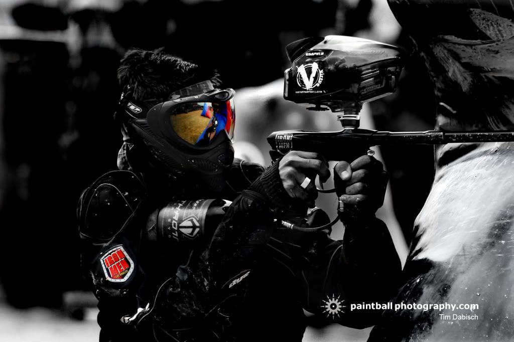
God you guys suck at rating the pictures above you
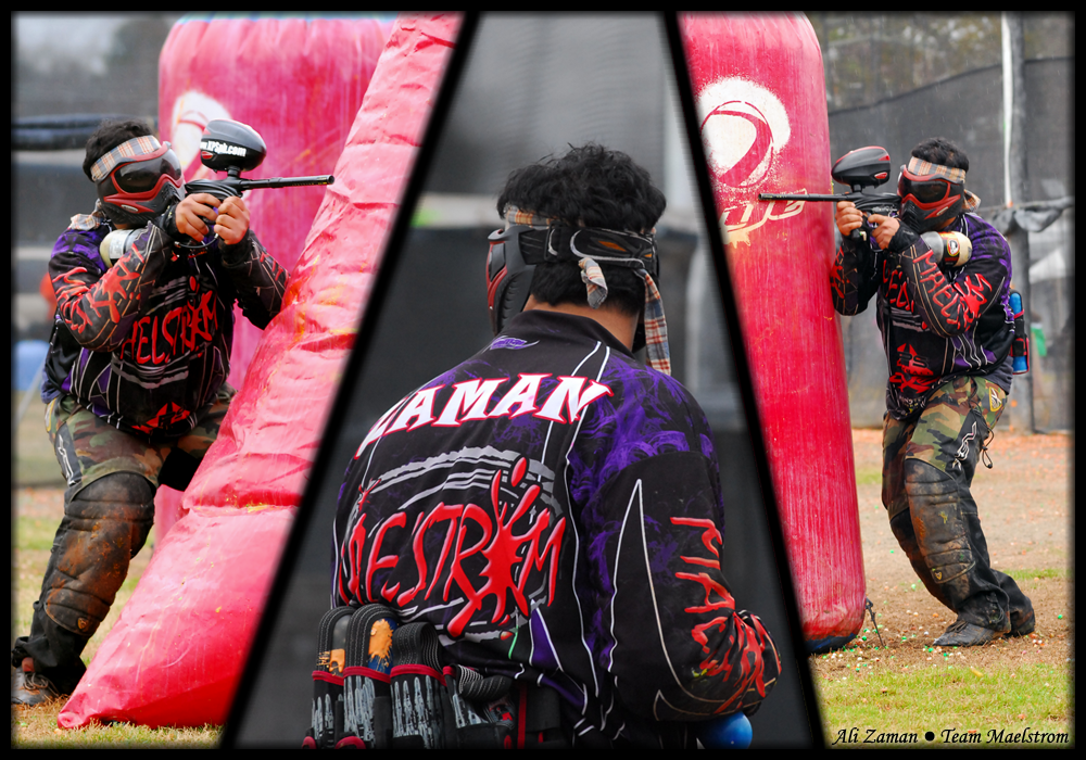
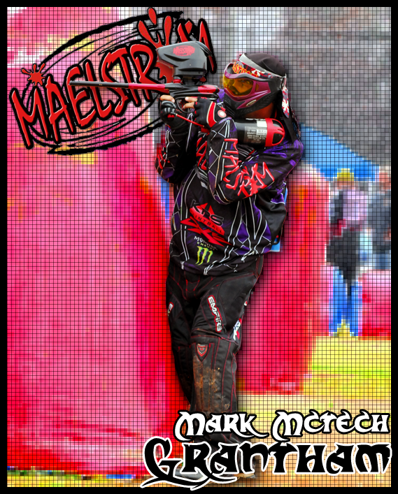
As for Omally, i think the first picture looks a bit chopy and out of place for some reason. 6.5/10
The second picture is absolutely amazing, its simple yet it really captures the player and the awsome resolution of that picture cmpared with the darkness you added would make that an awesome background. 10/10
the t-shirts are a bit plain and simple to do.
6/10 for complexity but 8.5/10 for asthetics just because id rock one anyday.
__________________
---------------------------
"Originally posted by SmArT-SpOrKs: Jesus Tapdancing christ this thread is a cluster**** on both sides. Its like the civil war, but replace muskets with pool noodles and everyone has a wicked sunburn."
ST PHOTOBUCKET_-_ ST:GDT 10,000 posts and counting
c4designs.org
|
|
|
|
|
02-21-2009, 09:49 AM
|
#1066
|
|
MJMfX.com Designer
Join Date: Dec 2003
Location: back in somich
|
Reality of the situation is no one in this forum is professional and no one has room to talk.
Design in action:
http://mjmfx.com/desktop/
Everything except for textures is vectored from scratch, keyboard literally took like 2 days. All hover is jQuery with image replacement, which is why the hovers are instant instead of having to wait for the hover images to load.
edit: Well, the page descriptions are jQuery, other hovers are plain ol' css.
Last edited by knuckhead09 : 02-21-2009 at 09:55 AM.
|
|
|
|
|
02-21-2009, 09:58 AM
|
#1067
|
|
|
Quote:
Originally Posted by knuckhead09
Reality of the situation is no one in this forum is professional and no one has room to talk.
Design in action:
http://mjmfx.com/desktop/
Everything except for textures is vectored from scratch, keyboard literally took like 2 days. All hover is jQuery with image replacement, which is why the hovers are instant instead of having to wait for the hover images to load.
edit: Well, the page descriptions are jQuery, other hovers are plain ol' css. |
is the big blank brown bit at the bottom intentional?
__________________
Insidious Designs - offering logo, jersey and webdesign. PM me for details.
|
|
|
|
|
02-21-2009, 09:59 AM
|
#1068
|
|
MJMfX.com Designer
Join Date: Dec 2003
Location: back in somich
|
Yeah, its not done, just the top part.
|
|
|
|
|
02-21-2009, 02:13 PM
|
#1069
|
|
Locker Magazine
Join Date: Oct 2005
Location: PA
|
Quote:
Originally Posted by r_racer11
God you guys suck at rating the pictures above you
As for Omally, i think the first picture looks a bit chopy and out of place for some reason. 6.5/10
The second picture is absolutely amazing, its simple yet it really captures the player and the awsome resolution of that picture cmpared with the darkness you added would make that an awesome background. 10/10
the t-shirts are a bit plain and simple to do.
6/10 for complexity but 8.5/10 for asthetics just because id rock one anyday.
|
I did notice that about my obey picture. Some of the lines need to be rounded. I made it in illustrator and Im going to touch it up in photoshop.
Thanks for the rating on my other two pics. the one of Alex Goldmen I really like. And the t-shirts one of my favorate designs.
As far as it being said there are no pros here, thats not entirely true. What makes you good in design is to be able too make what your customer wants, and to not over complicate your design, so that it is easy to understand.
Thats why typeography is the most Important part of design. Talk to any designer and he will tell you the same thing. |
|
|
|
|
02-22-2009, 10:20 PM
|
#1070
|
Join Date: Feb 2009
Location: **** Texas
|
Jesus Christ this thread has turned in to a flamefest. Kids aren't even posting ratings for the kids who actually care and follow the rules, before flaming. Come on guys post up your work and leave your unnecessary comments to the side. All posts should have a rating and piece of artwork in them no questions asked.
|
|
|
|
|
02-22-2009, 10:22 PM
|
#1071
|
|
VCU Rams
Join Date: Apr 2005
Location: Richmond, VA
|
Quote:
Originally Posted by omally jones
|
7/10.
just something...
i couldnt really think of anything cool to do
__________________
KPS PAINTBALL | VCU RAMS | RICHMOND RAGE
|
|
|
|
 Posting Rules
|
You may not post new threads
You may not post replies
You may not post attachments
You may not edit your posts
HTML code is Off
|
|
|
|


 Your Privacy Choices