Quote:
Originally Posted by ||SoCaLkId||

The font you used for the canterbury thought society is hard to read. If this is a poster that is going to be put up at your school you shouldn't use fonts that are hard too hard to read because the students are just walking past.
also if this is going into print production i would suggest the color index by Jim Krause. It is a good source for color harmonies and anything that will be printed.
poster im working on for typography class...
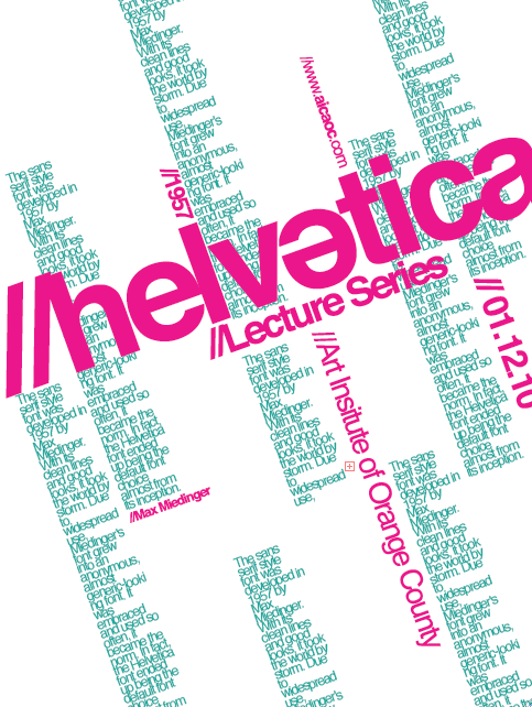 |
That was my main concern when I decided to use that font, but since the kids at my school don't know anything about typography (not that I know that much myself, but they go around slapping Papyrus and Comic Sans on everything), that type of font, which they have probably never seen before would be interesting enough to catch their attention. Like a little puzzle. I'm curious about what you think of my little plan.
Also, thanks for the tip on that book, I think I'll order it. It's good to have some design students, which I assume you are, in here every once in a while.
About your poster, I can't really come up with much critique beyond that I don't know what the square with the "+" sign in it means. It's right next to "of." I like the colors, and I like the flow.
Regarding the guy above me, the font style fits in my opinion, but it is a little hard to read. The logo itself is also just not exceptionally creative. Nothing about that card is memorable.
If you want some inspiration,
http://digg.com/search?s=business+card .


 Your Privacy Choices