 04-18-2009, 04:43 AM
|
#1157
|
|
Guest
|
7-10

im new to photoshop so some ideas on what i could do would be appreaited |

|
|
|
04-18-2009, 12:20 PM
|
#1158
|
|
The mad santa hatter
Join Date: May 2007
Location: random GDT
|
Considering you are new to photoshop id say you did an amazing job with this picture, most people absolutely butcher a picture with filters. Id say you found a very nice mix between a subtle filter and color masking. The only suggestions i would make would be to add some text or something to take up the open space on the top and clean up the edges of the bunker a bit where that black line is. Masking out the filter on the players lense could also be a nice idea and add some more contrast to the picture.
Overall and considering your new id give this an 8/10 just remember that filters dont always make a good picture so  for keeping it subtle.
edit: lemme find a picture to post
edit 2:
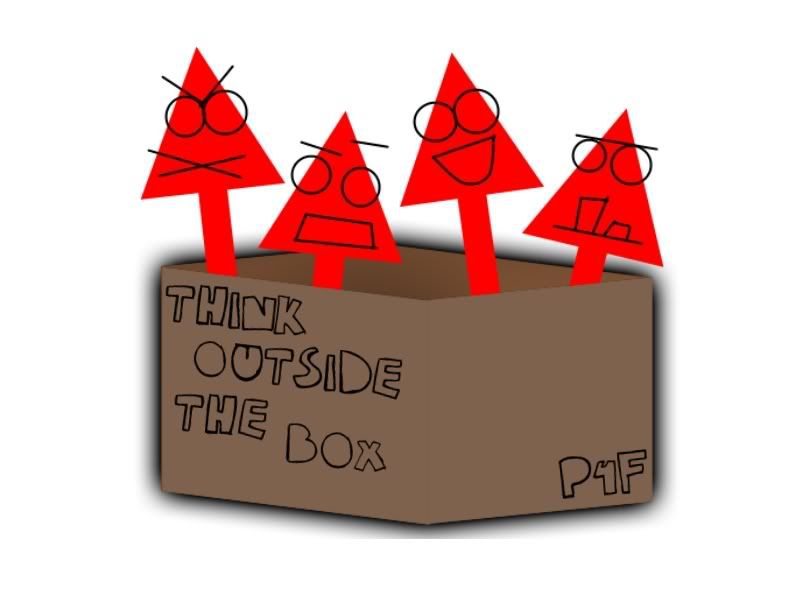
My web teacher signed me up for this doodle for google contest, the entry had to look somewhat drawn and had to depict something about the enviorment

__________________
---------------------------
"Originally posted by SmArT-SpOrKs: Jesus Tapdancing christ this thread is a cluster**** on both sides. Its like the civil war, but replace muskets with pool noodles and everyone has a wicked sunburn."
ST PHOTOBUCKET_-_ ST:GDT 10,000 posts and counting
c4designs.org
Last edited by r_racer11 : 04-18-2009 at 01:41 PM.
|
|
|
|
|
04-18-2009, 05:00 PM
|
#1159
|
|
p4f
Join Date: Apr 2007
Location: UK
|
7/10. Does look slightly like it has been drawn by hand. However, it isn't really that striking.
random doodling |
|
|
|
|
04-19-2009, 01:17 PM
|
#1160
|
|
MJMfX.com Designer
Join Date: Dec 2003
Location: back in somich
|
5/10, kinda cool idea but like you said it's just random doodling.
 |
|
|
|
|
04-19-2009, 11:39 PM
|
#1161
|
|
|
Quote:
Originally Posted by knuckhead09

5/10, kinda cool idea but like you said it's just random doodling.
|
9/10
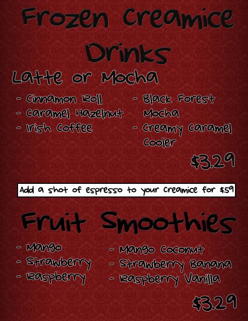
I had to make a sign for this coffee shop. I told them I'd do it for free, obviously, because I am terrible at things like this. But suggestions are always appreciated. 
 |
|
|
|
|
04-20-2009, 02:55 AM
|
#1162
|
|
RoyaleW/Cheezburgr
Join Date: Nov 2004
Location: Oregon
|
6.9420/10.
I like the background.
I don't like the main black font, it's spacing, or the size ratio.
I don't like the 3.29, twice. I think it would be simpler to list it only once, or maybe include a line clarifying that everything is 3.29
The sillyer font for the listings is good.
Also, if you're going to include a seperator like that, I don't suggest the block of white, maybe something that fits into the background more. smoothly. and $59? there's no clarification on that either.
Meant to be helpful criticism. The overall composure is decent, but imho that's the stuff I would have done differently.
I vectorized some oakley frogskins, delogoed them, etc.
 |
|
|
|
|
04-20-2009, 08:54 AM
|
#1163
|
|
burp
Join Date: Aug 2005
Location: atl
|
Quote:
Originally Posted by r_racer11
Considering you are new to photoshop id say you did an amazing job with this picture, most people absolutely butcher a picture with filters. Id say you found a very nice mix between a subtle filter and color masking. The only suggestions i would make would be to add some text or something to take up the open space on the top and clean up the edges of the bunker a bit where that black line is. Masking out the filter on the players lense could also be a nice idea and add some more contrast to the picture.
Overall and considering your new id give this an 8/10 just remember that filters dont always make a good picture so for keeping it subtle.
edit: lemme find a picture to post
edit 2:
My web teacher signed me up for this doodle for google contest, the entry had to look somewhat drawn and had to depict something about the enviorment
|
I know I'm going completely out of order here, but that's fantastic design right there. Bravo to you sir, it's some of the best work in the thread IMO. |
|
|
|
|
04-20-2009, 01:20 PM
|
#1164
|
|
Computer Controlled
|
Quote:
Originally Posted by r_racer11
Considering you are new to photoshop id say you did an amazing job with this picture, most people absolutely butcher a picture with filters. Id say you found a very nice mix between a subtle filter and color masking. The only suggestions i would make would be to add some text or something to take up the open space on the top and clean up the edges of the bunker a bit where that black line is. Masking out the filter on the players lense could also be a nice idea and add some more contrast to the picture.
Overall and considering your new id give this an 8/10 just remember that filters dont always make a good picture so for keeping it subtle.
edit: lemme find a picture to post
edit 2:
My web teacher signed me up for this doodle for google contest, the entry had to look somewhat drawn and had to depict something about the enviorment
|
Mad awesome. 10/10. |
|
|
|
|
04-20-2009, 02:47 PM
|
#1165
|
|
Guest
|
Quote:
Originally Posted by dairoll
6.9420/10.
I like the background.
I don't like the main black font, it's spacing, or the size ratio.
I don't like the 3.29, twice. I think it would be simpler to list it only once, or maybe include a line clarifying that everything is 3.29
The sillyer font for the listings is good.
Also, if you're going to include a seperator like that, I don't suggest the block of white, maybe something that fits into the background more. smoothly. and $59? there's no clarification on that either.
Meant to be helpful criticism. The overall composure is decent, but imho that's the stuff I would have done differently.
I vectorized some oakley frogskins, delogoed them, etc.
|
6.5/10
very well done wtih shadows and such but very basic

im new to photoshop so keep that in mind when rateing and please, tips are appreaited |
|
|
|
|
04-20-2009, 03:12 PM
|
#1166
|
|
burp
Join Date: Aug 2005
Location: atl
|
2.
Not really aesthetically appealing at all, rather plain. And tips? I guess don't shop like that...
|
|
|
|
|
04-21-2009, 05:55 AM
|
#1167
|
|
Guest
|
now how about we let someone who has another picture to post come here and rate it so we can then rate there work. oh and btw thanks for being an *** hole, i know i suck, thats why i want pointers
|
|
|
|
|
04-21-2009, 09:09 AM
|
#1168
|
|
burp
Join Date: Aug 2005
Location: atl
|
Quote:
Originally Posted by unban_P0T_H3@D_now
now how about we let someone who has another picture to post come here and rate it so we can then rate there work. oh and btw thanks for being an *** hole, i know i suck, thats why i want pointers
|
 |
|
|
|
|
04-21-2009, 09:24 AM
|
#1169
|
Join Date: Feb 2009
Location: **** Texas
|
Quote:
Originally Posted by Benjammin822
|
10

Everything is filters and some saturation/contrast, easy work. |
|
|
|
|
04-21-2009, 03:56 PM
|
#1170
|
|
The mad santa hatter
Join Date: May 2007
Location: random GDT
|
Quote:
Originally Posted by unban_P0T_H3@D_now
6.5/10
very well done wtih shadows and such but very basic
im new to photoshop so keep that in mind when rateing and please, tips are appreaited |
OK first of all im going to give you some props on the cutout of the player, done very cleanly for a beginner. Now 2 things that are always over done with newcommers to photoshop is hue, saturation, contrast, ect... and filters. I honestly cant tell wether you used some kind of filter or you just cranked up the hue and contrast all the way up. Either way you kinda butchered the background, keep those things to a minimum and thats when your work starts to improve.
Sully: Ive always liked your work, that would make an amazing desktop wallpaper only two suggestions i would make would be to maybe have the text block perfectly vertical rather than slanted and remove the white shillouette of the players mask; it really takes away from the nice negative space you had going with the player. 8.5/10
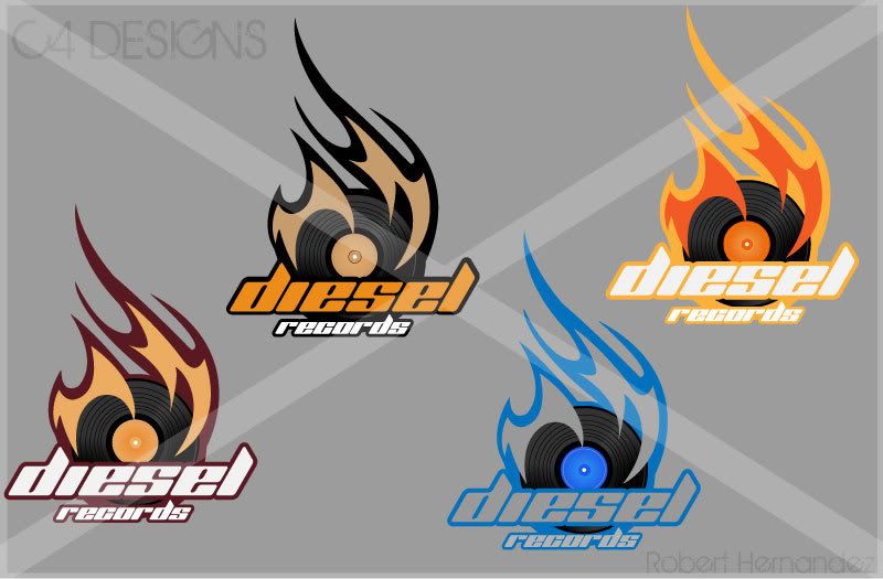
Heres something i made today, its a rough draft for a logo for a record company.
__________________
---------------------------
"Originally posted by SmArT-SpOrKs: Jesus Tapdancing christ this thread is a cluster**** on both sides. Its like the civil war, but replace muskets with pool noodles and everyone has a wicked sunburn."
ST PHOTOBUCKET_-_ ST:GDT 10,000 posts and counting
c4designs.org
|
|
|
|
|
04-21-2009, 04:25 PM
|
#1171
|
|
Bleed Blue & White
Join Date: Oct 2005
Location: Philadelphia
|
The top left one is my favorite if you matched the text maybe. I can't decide unless I saw it. The top right is nice too but maybe thin the stroke around the flames a few pixels.
My other suggestion is clean up the record. Knowing you, you probably made it yourself and they look kind of sketchy.
8/10
Some stupid banner I made for someone. I have made anything in awhile but wanted to comment on that.


Last edited by Jonezed7 : 04-21-2009 at 07:02 PM.
|
|
|
|
|
04-22-2009, 03:11 PM
|
#1172
|
|
Ya I wear pink, got beef?
Join Date: Apr 2009
Location: the woods New york
|
9/10 i dont get what its for
 |
|
|
|
|
04-22-2009, 08:10 PM
|
#1173
|
Join Date: Feb 2009
Location: **** Texas
|
Quote:
Originally Posted by TheyCallMePinky
9/10 i dont get what its for
|
What the hell is this? I'd give you a 1, but ill be nice and give you a 2 for the pink JT's.
 |
|
|
|
|
04-22-2009, 09:45 PM
|
#1174
|
|
The mad santa hatter
Join Date: May 2007
Location: random GDT
|
Kinda harsh dont you think? I guess its somewhat in order though, i dont know when people are going to learn that theres really no skill in using 2 filters and doing a simple cropping.
7/10 for yours, the hue and color scheme is on target but your text choice really throws out the balance, id suggest a different font.
Something we had to do for graphics class....we had to modify the interior of a house.
heres my version:
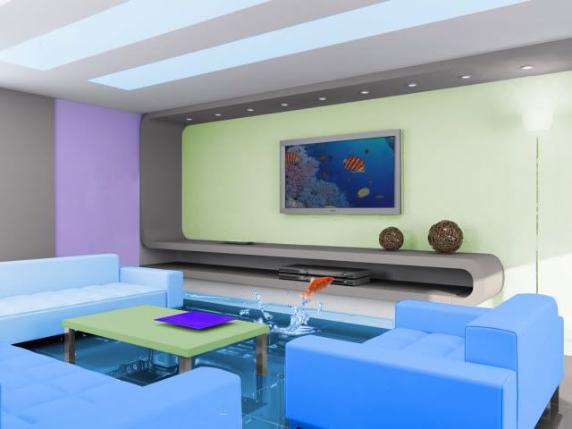
Heres the original:
http://www.softpicks.net/screenshots...creensaver.jpg
__________________
---------------------------
"Originally posted by SmArT-SpOrKs: Jesus Tapdancing christ this thread is a cluster**** on both sides. Its like the civil war, but replace muskets with pool noodles and everyone has a wicked sunburn."
ST PHOTOBUCKET_-_ ST:GDT 10,000 posts and counting
c4designs.org
Last edited by r_racer11 : 04-22-2009 at 10:00 PM.
|
|
|
|
|
04-23-2009, 01:20 PM
|
#1175
|
Join Date: Feb 2009
Location: **** Texas
|
Yeah everything i do is by request besides the one im about to post which was for a graphics project. He picked the fonts and pretty much everything. Id give myself a 6 lol. I haven't really given you a in depth review on any of your work yet so as mine as well.
I have always thought your work is extremely professional. Pening each figure in the room and masking the color takes time. You kept it simple, and didn't alter the original composition much, besides giving it an almost aquarium feel. The floor is cool. Im trying to figure out what you did to it, but so far, my best guess is plastic wrap filter? Either way it gave it a water feel and looks good. The fish is by far what makes the piece for me, due to the fact it gave it some flair and went well with the water floor. If the fish wasn't there, i probably wouldn't have really noticed it as water and more like you just altered some colors around. Interesting to see how such small details bring a piece together. Due to the fact that i have nothing to critique you get 9.5, i decided to take .5 off due to the fact i wasn't amazed, just intrigued.
This is one of my Sophmore Computer Apps projects. I don't do anything in that class besides steal photoshop discs and do it at home lol. We had to pick a photo of a person in the woods and needed to give it a grudge/horror movie feel. This took me like an hour, due to the fact that i had to mix 9ish different textures and overlay them. Rest is filters, contrast, burning and the black and white tool in Cs3. An no this is not me. Got the pic of Pbscene. Critiques are appreciated, because our project of the month contest is up next week and i need to win the free 100 to pass the class lol.
Before.

After.

Last edited by Sully. : 04-23-2009 at 01:24 PM.
|
|
|
|
|
04-23-2009, 01:50 PM
|
#1176
|
|
MJMfX.com Designer
Join Date: Dec 2003
Location: back in somich
|
2/10
Work in progress:

That will be a jQuery animated slideshow. |
|
|
|
 Posting Rules
|
You may not post new threads
You may not post replies
You may not post attachments
You may not edit your posts
HTML code is Off
|
|
|
|


 Your Privacy Choices