 02-23-2009, 02:05 PM
|
#1072
|
|
Locker Magazine
Join Date: Oct 2005
Location: PA
|
I like it. everything blends nicely.
|

|
|
 Sponsored Links
|
Remove Advertisement
|
|
Advertisement
|
|
|
02-23-2009, 02:29 PM
|
#1073
|
|
p4f
Join Date: Apr 2007
Location: UK
|
Quote:
Originally Posted by omally jones

I like it. everything blends nicely.
|
Could you post an image please?
kthxbye |
|
|
|
|
02-23-2009, 02:35 PM
|
#1074
|
|
The mad santa hatter
Join Date: May 2007
Location: random GDT
|
Quote:
Originally Posted by Stencil
Could you post an image please?
kthxbye
|
Isnt that a little hypocritical considering you didnt post a picture either.
Anyways heres a logo i made for someone in the free thread.

o btw 7/10 for the picture above, simple yet clean. I just dont like filters that much so im being biased
__________________
---------------------------
"Originally posted by SmArT-SpOrKs: Jesus Tapdancing christ this thread is a cluster**** on both sides. Its like the civil war, but replace muskets with pool noodles and everyone has a wicked sunburn."
ST PHOTOBUCKET_-_ ST:GDT 10,000 posts and counting
c4designs.org
|
|
|
|
|
02-23-2009, 02:43 PM
|
#1075
|
|
Bleed Blue & White
Join Date: Oct 2005
Location: Philadelphia
|
Quote:
Originally Posted by r_racer11
Isnt that a little hypocritical considering you didnt post a picture either.
Anyways heres a logo i made for someone in the free thread.
o btw 7/10 for the picture above, simple yet clean. I just dont like filters that much so im being biased |
You've got mad talent racer, 9/10. The gun needs cleaned up a little, that's all.
Sticker design I made for someone.
 |
|
|
|
|
02-23-2009, 03:03 PM
|
#1076
|
|
VCU Rams
Join Date: Apr 2005
Location: Richmond, VA
|
Quote:
Originally Posted by r_racer11
Isnt that a little hypocritical considering you didnt post a picture either.
Anyways heres a logo i made for someone in the free thread.
[IM G]http://i89.photobucket.com/albums/k208/rracer11/bodycount.png[/IMG]
o btw 7/10 for the picture above, simple yet clean. I just dont like filters that much so im being biased
|
thanks.
i think im a bit different, i dont mind filters, as long as they arent over done.
i wouldve tried to do something else, but im honestly running out of creative ideas to do with PS, lol.
__________________
KPS PAINTBALL | VCU RAMS | RICHMOND RAGE
|
|
|
|
|
02-23-2009, 10:39 PM
|
#1077
|
|
Fly or Die
Join Date: Oct 2005
Location: Maryland
|
Made this for my girlfriend.
PS and paper and ink.

Jonzed- not sure what you are going for but i don't dig brass knuckles on any thing and I don't really like the font either. It looks like you made it for someone so I hope they like it. It's just not my style.
__________________
waiting 4 mdt 2 c0me back
|
|
|
|
|
02-24-2009, 08:20 AM
|
#1078
|
|
Honda S2000
|
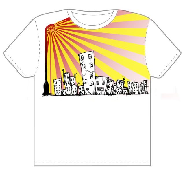
Faces seem a bit choppy, but it looks like thats what the theme is. Pretty cool, how'd she like it? 8/10
Another shirt I made when I got bored in graphics class.
 |
|
|
|
|
02-24-2009, 10:41 AM
|
#1079
|
|
VCU Rams
Join Date: Apr 2005
Location: Richmond, VA
|
8/10, i like it.
was any of it hand drawn? or is it all PS?
heres a simple logo i made, this is more for a question than anything-
can anyone help me understand why some lines become pixelated?(like on the back of the P, in KPS) im working at a resolution of 200 pixels per inch i believe, does that have something to do with it?

__________________
KPS PAINTBALL | VCU RAMS | RICHMOND RAGE
|
|
|
|
|
02-24-2009, 10:50 AM
|
#1080
|
|
inconceivable
Join Date: Mar 2004
Location: NJ
|
5/10...its nice, its just SO simple
picture i just did of me cause i was bored at work...i dont think this is great by any means, just something i did

and a revised version

__________________
Playground Royals To be a rock and not to roll
Last edited by East§ide : 02-24-2009 at 11:19 AM.
|
|
|
|
|
02-24-2009, 11:52 AM
|
#1081
|
|
|
idk 5/10?
i got bored while the power went out..made this:
 |
|
|
|
|
02-25-2009, 11:56 AM
|
#1082
|
|
Subtle like a T-Rex
Join Date: Aug 2002
Location: Yakima, WA
|
Nice. I like the text treatment, the D3 X-Ball part doesn't blend well for a sub element but it probably doesn't matter if this isn't made for anything other than anti-boredom. 6.5/10
Here is something I've been working on, new layout for an existing site.
The text isn't really set yet, what is placed is just for positioning. I feel like it needs more contrast, the blacks need to be darker. I'm looking for constructive critisism not "dude that is So crappy buhahaha"
Large jpg so the pic is under the cut.
http://www.mainstreampb.com/MSPBtest.jpg
Quote:
Originally Posted by East§ide
the only thing i dont love about the website is the blobs/splatter in the top left..otherwise, i like it alot
8/10
|
Thanks Eastside, I agree, it doesn't really fit but unfortunately that is their logo. (Unless you meant the black splatter on the background layer, it does look out of place.
Last edited by MinorThreat : 02-25-2009 at 12:13 PM.
|
|
|
|
|
02-25-2009, 12:05 PM
|
#1083
|
|
inconceivable
Join Date: Mar 2004
Location: NJ
|
the only thing i dont love about the website is the blobs/splatter in the top left..otherwise, i like it alot
8/10
__________________
Playground Royals To be a rock and not to roll
|
|
|
|
|
02-25-2009, 12:42 PM
|
#1084
|
|
MJMfX.com Designer
Join Date: Dec 2003
Location: back in somich
|
Quote:
Originally Posted by MinorThreat
Nice. I like the text treatment, the D3 X-Ball part doesn't blend well for a sub element but it probably doesn't matter if this isn't made for anything other than anti-boredom. 6.5/10
Here is something I've been working on, new layout for an existing site.
The text isn't really set yet, what is placed is just for positioning. I feel like it needs more contrast, the blacks need to be darker. I'm looking for constructive critisism not "dude that is So crappy buhahaha"
Large jpg so the pic is under the cut.
http://www.mainstreampb.com/MSPBtest.jpg |
Definitely not bad at all. I'd actually keep the dark grey.. I like to avoid using absolute colors (white, black, red, blue, yellow).
I would left or right justify the content on the right, centering doesn't create strong alignment.
I know your typography isn't finalized, but if you wanted to use text links for the navigation you'll need a web safe font. If you wanted to use images, I'd make better use of them by using a creative navigation that require images (text links > image links for search engine purposes, but usability > SEO, so if you can make a navigation that increases usability more than it decreases SEO, go for it).
For the content containers on the left, try playing around with some transparency rather than solid black (kind of like you did on the transparency gradient, only solid transparency).
Is this going to be like a web-based advertisement or a full blown website? If there is going to be content, you'll have to consider where you're going to put that.
You'll probably also want to avoid the 'click for details' text link, as search engines won't like that quite as much as something more in context (like say, 'May 2nd event details').
Sorry for the non-image post, but I wanted to comment on this and didn't have any new work I wanted to post. |
|
|
|
|
02-25-2009, 09:21 PM
|
#1085
|
|
Bleed Blue & White
Join Date: Oct 2005
Location: Philadelphia
|
Quote:
Originally Posted by MinorThreat
Nice. I like the text treatment, the D3 X-Ball part doesn't blend well for a sub element but it probably doesn't matter if this isn't made for anything other than anti-boredom. 6.5/10
Here is something I've been working on, new layout for an existing site.
The text isn't really set yet, what is placed is just for positioning. I feel like it needs more contrast, the blacks need to be darker. I'm looking for constructive critisism not "dude that is So crappy buhahaha"
Large jpg so the pic is under the cut.
http://www.mainstreampb.com/MSPBtest.jpg
Thanks Eastside, I agree, it doesn't really fit but unfortunately that is their logo. (Unless you meant the black splatter on the background layer, it does look out of place. |
9/10. It looks very good and clean.
I was bored...

Guys, please stop with the text posts...
Last edited by Jonezed7 : 02-25-2009 at 09:34 PM.
|
|
|
|
|
02-26-2009, 09:43 AM
|
#1086
|
|
eat a bleepin dorito
Join Date: Jun 2007
Location: *386 FL
|
Not bad,
7/10.
Some of you guys might have seen the post a few pages back. This is close to my final design:

Any suggestions? This is my first Logo using Illustrator, and I'm also playing with the tag line "Growing you a better future"
edit:
Damn, what ever happened to image hosts these days? They just destroy the images 
Last edited by cerealkiller_ : 02-26-2009 at 09:53 AM.
|
|
|
|
|
02-26-2009, 12:10 PM
|
#1087
|
|
MJMfX.com Designer
Join Date: Dec 2003
Location: back in somich
|
I don't like the separation of the orange and brown, I feel like the two brown parts (county, foundation) should be down at the bottom together, and the two orange parts (flagler, education) should be together at the top. I first read 'Flagler Education', then look on to the 'County Foundation', then figure out that it's supposed to be 'Flagler County Education Foundation'. In order to fix that you'd have to make the 'County' the bold orange and the 'Education' the small brown.
It's all objective, of course, but that's how my brain interprets it.
Shirt design I did for the paintball club here at MTU:
 |
|
|
|
|
02-26-2009, 12:33 PM
|
#1088
|
|
Bleed Blue & White
Join Date: Oct 2005
Location: Philadelphia
|
8/10
I'm not a fan of the center text but the rest looks really good 
Logo I made for someone. (he picked the text)
 |
|
|
|
|
02-26-2009, 12:37 PM
|
#1089
|
|
inconceivable
Join Date: Mar 2004
Location: NJ
|
7/10
i like the tree alot, i just dont thik the font and the tree go together..i know he picked the font,but it doesnt flow
this is just something dumb i was playing around with...not a serious design or anything

__________________
Playground Royals To be a rock and not to roll
|
|
|
|
|
02-26-2009, 12:57 PM
|
#1090
|
|
Bleed Blue & White
Join Date: Oct 2005
Location: Philadelphia
|
The background doesn't really make sense and I'd leave out the rest of the white that's not outlining.
6/10
 |
|
|
|
|
03-02-2009, 01:51 AM
|
#1091
|
|
MJMfX.com Designer
Join Date: Dec 2003
Location: back in somich
|
It's alright.. your dime a dozen paintball logo, but I'm sure they'll like it
Just got Illustrator and a tablet, been 'painting' this:

~4 hours invested so far, but it's really teaching me how to use the tablet which is the overall goal. |
|
|
|
|
03-02-2009, 12:00 PM
|
#1092
|
|
Bleed Blue & White
Join Date: Oct 2005
Location: Philadelphia
|
Quote:
Originally Posted by knuckhead09
It's alright.. your dime a dozen paintball logo, but I'm sure they'll like it
Just got Illustrator and a tablet, been 'painting' this:
~4 hours invested so far, but it's really teaching me how to use the tablet which is the overall goal. |
You didn't actually rate it.... |
|
|
|
 Posting Rules
|
You may not post new threads
You may not post replies
You may not post attachments
You may not edit your posts
HTML code is Off
|
|
|
|


 Your Privacy Choices